
I’ve been very fortunate to have some really great cover art on the covers of my books, and I appreciate the compliments from you readers, although I really have very little to do with how they turn out, but I thought you might want to get a sense of the process from my point of view. (I really should talk to a book cover designer for this post, but I don’t actually know any, as they are kept in witness protection by the publisher.)
I finished the manuscript for my next novel, Anima Rising, in the Fall of 2024, but we were discussing cover art months before that. The plot involves the Viennese painter, Gustav Klimt, who finds a woman floating the the Danube Canal early one morning on his way home from an all-nighter. The woman, drowned and naked, reminds him of his own paintings, and he’s fascinated with drawing her on the spot. It goes on from there.
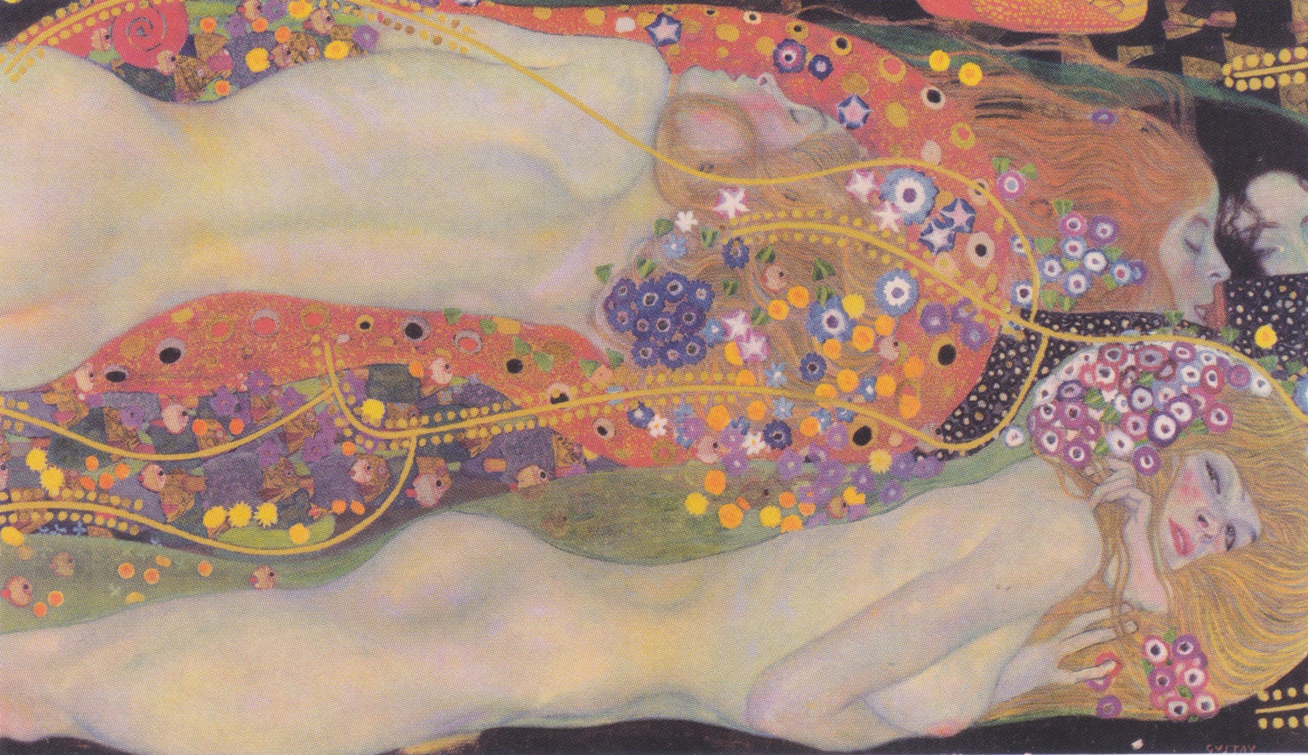
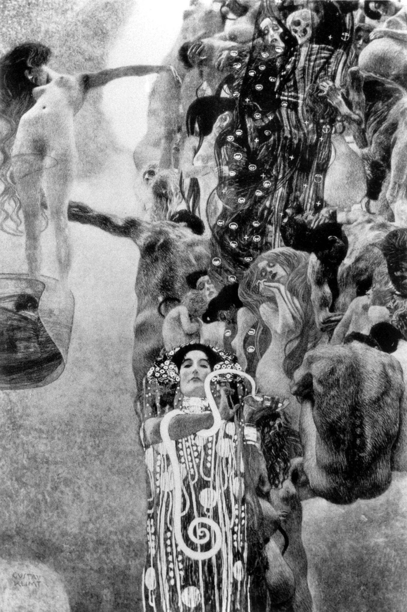
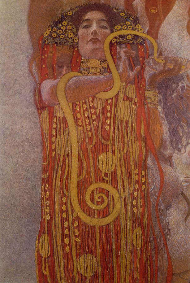
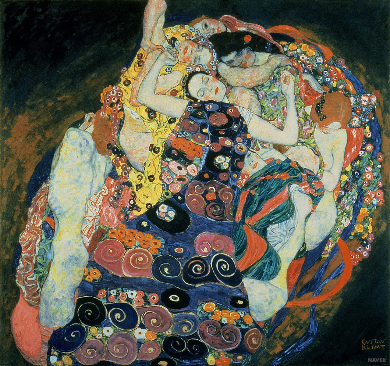
What drew me to Klimt as a character in the first place were his beautiful paintings, so I thought it would be great if we could use either an image of them, or use them as inspiration. Here are the Klimt images I sent to my editor as taking off points.

the woman he finds “Judith” as she can’t remember her name.
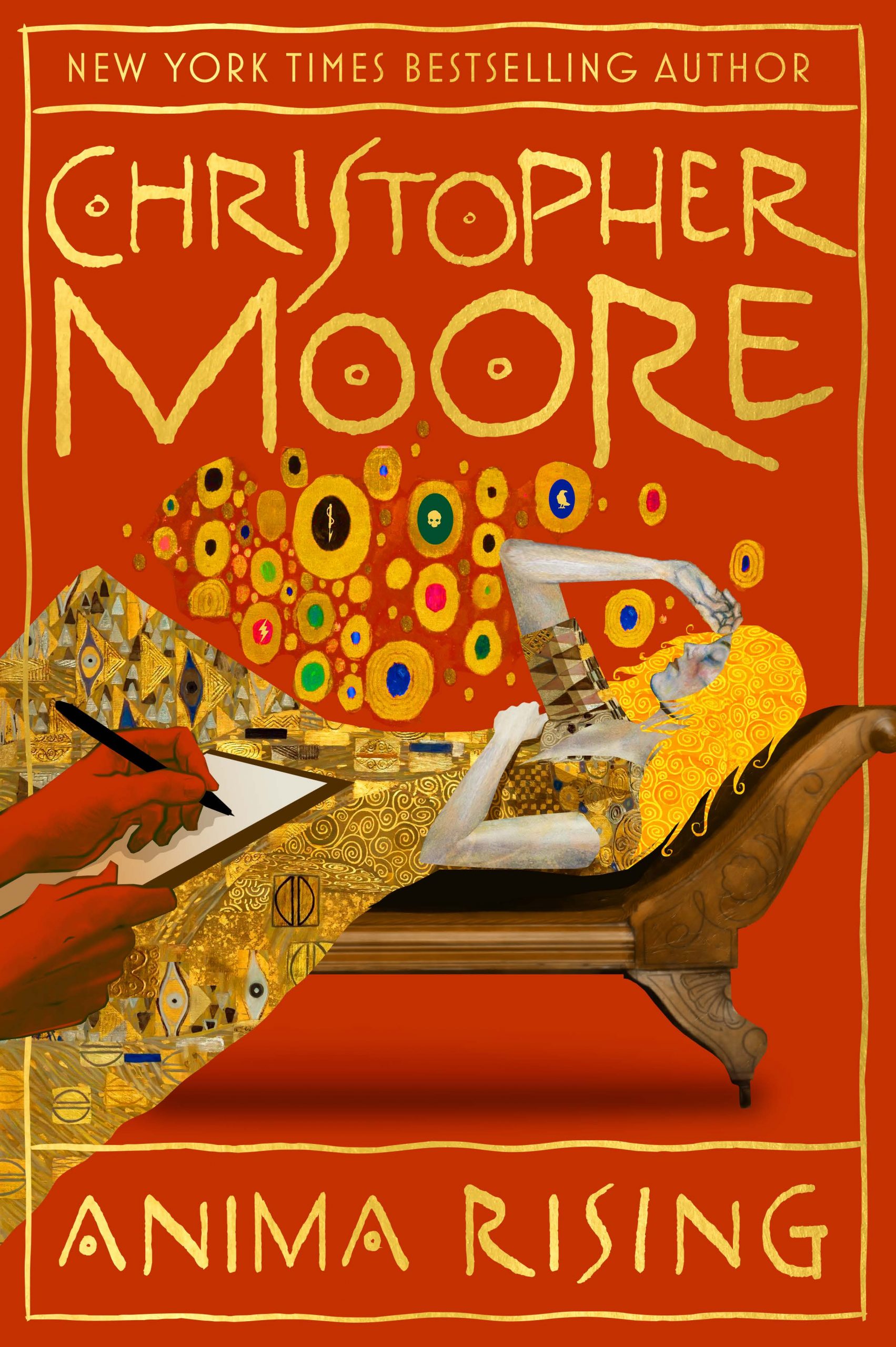
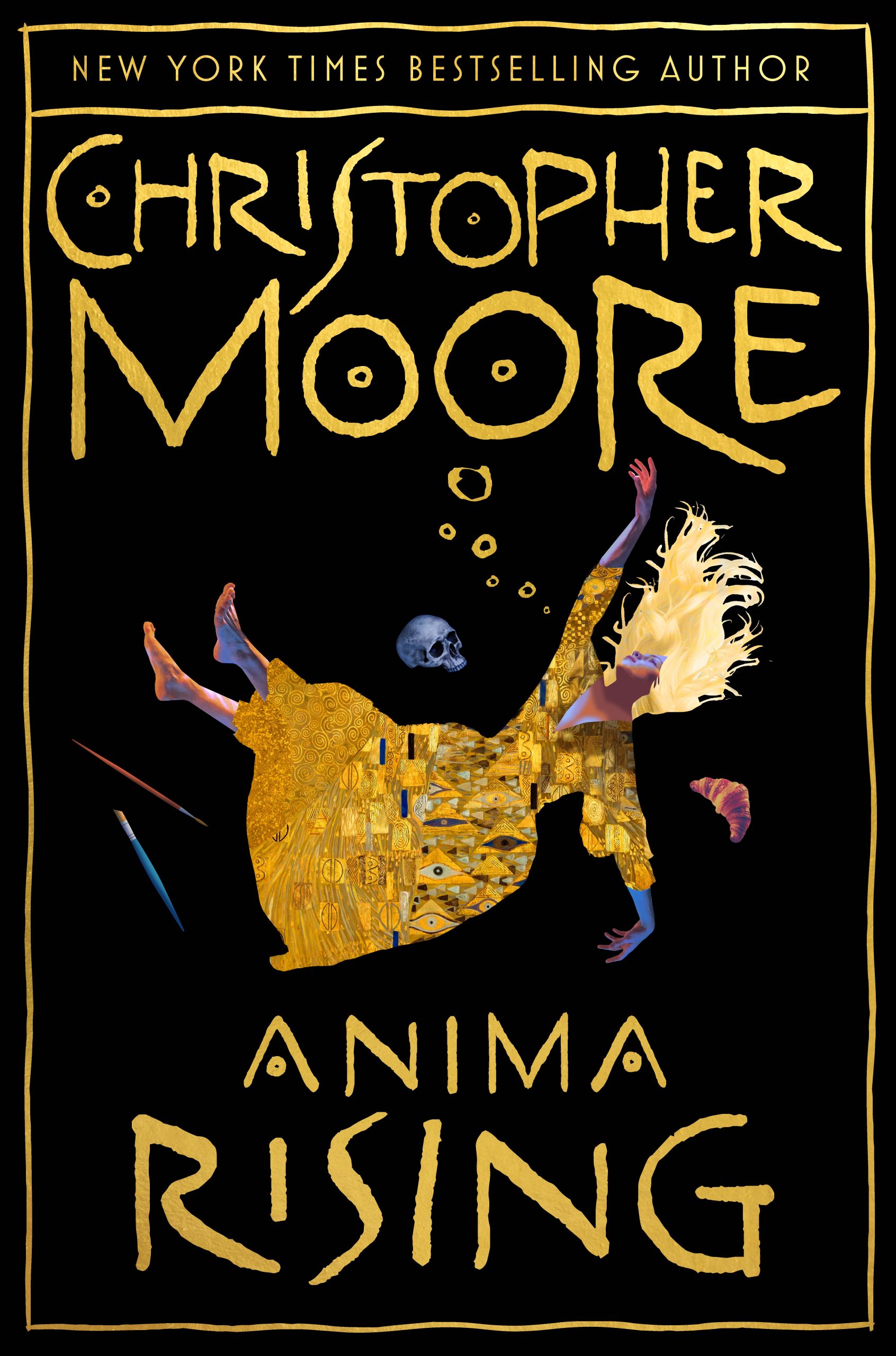
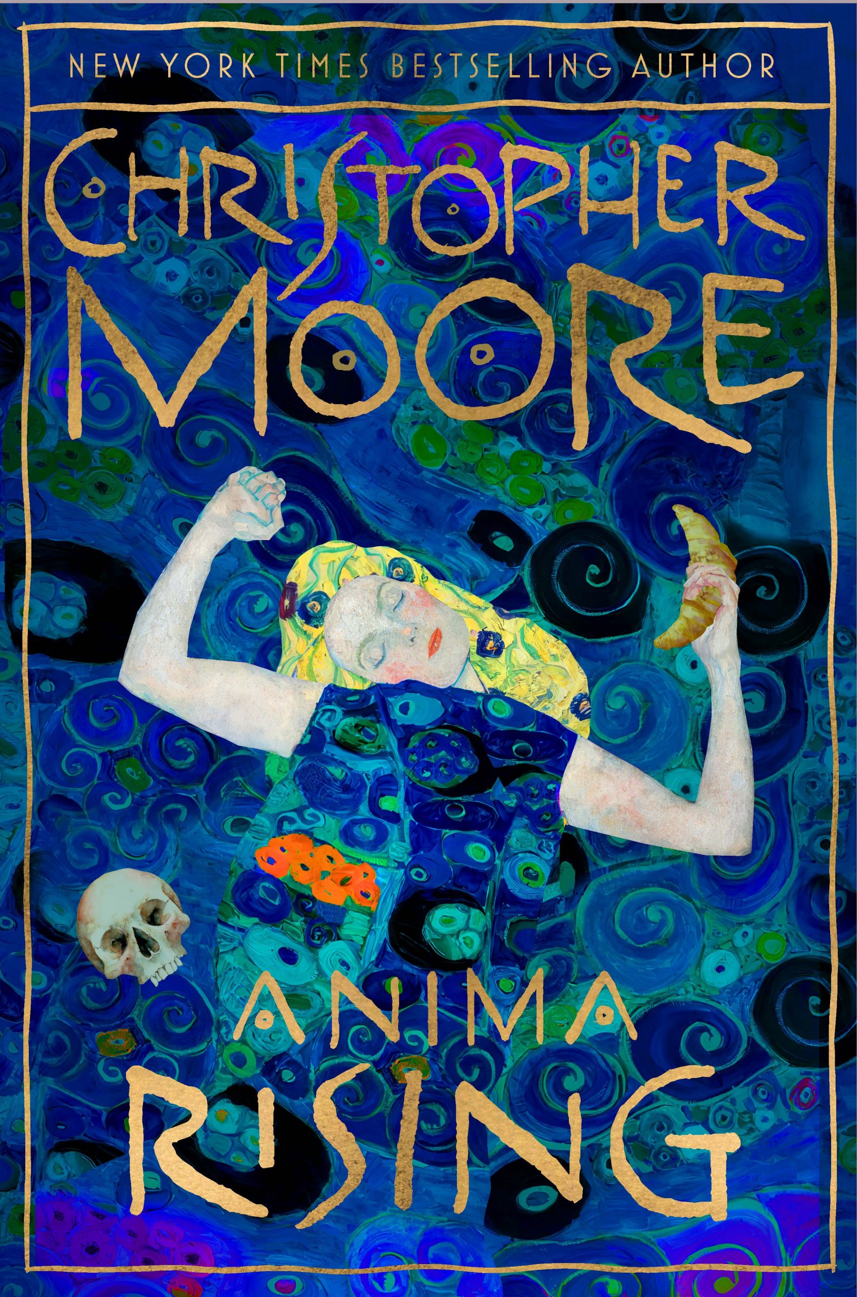
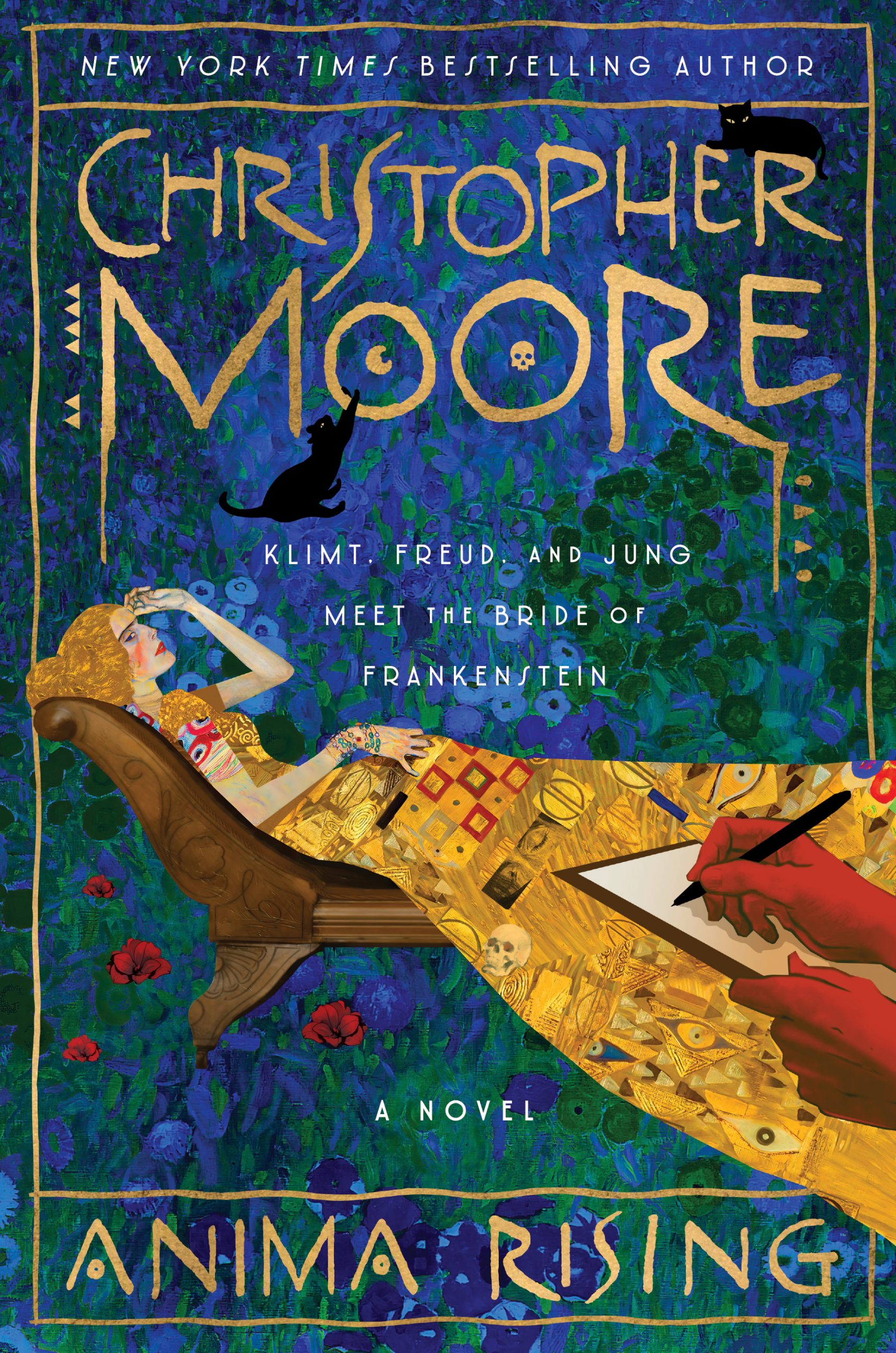
So here is the 1st round of composite sketches, the designer, Will Staehle, who has done a lot of my covers, delivered, adding elements from the plot, as well as from his own knowledge of Klimt’s art.
The results are really stunning, I think, and any of them would have made a good cover.
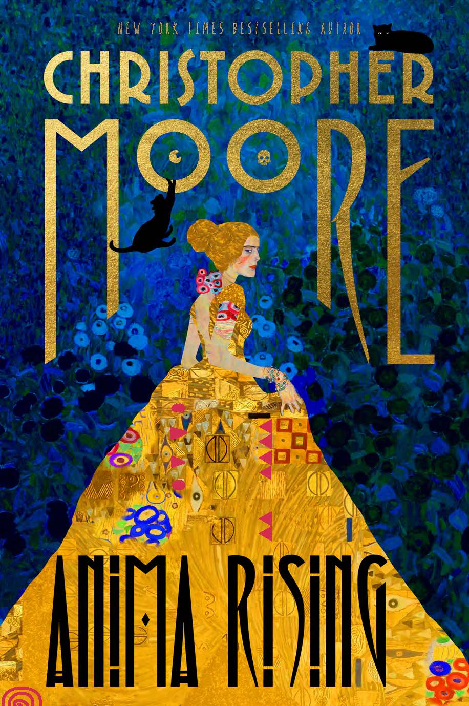
and color patterns often found in Klimt’s landscape work. I love that Will incorporated a cat into the design.

with a walled garden, and they figure in the story in Anima Rising.
is revealed through hypnotic regression. Will shows the surreal dreamscape of one of these sessions, with Klimtian motifs.
very much like one that Klimt designed himself, and used in much of has graphic work.
Klimt was the only fine art painter I know of, who worked in the Art Nouveau style.
Other artist working in the style were printmakers and illustrators.
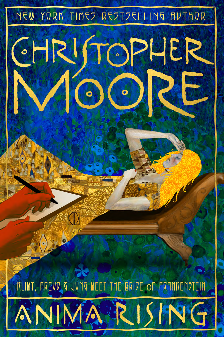
And finally, we settled on this one:
I need to acknowledge here, that I’ve been very, very lucky to have input on my covers. I wasn’t even asked on some of the early books, and some really dreadful covers resulted, or at least covers I don’t like. (The hardcover of Bloodsucking Fiends is borderline ugly.) I’m continually amazed at the flexibility and openness that graphic artists, illustrators, and designers bring to their work. Sometimes a suggestion might take the cover down a wrong direction and it might need to be abandoned, sending the artist back to the drawing board, so to speak, yet they always comeback quickly and professionally with great new designs. Considering what a whiny little bitch I can be when someone asks me to make a change to my work, I very much admire the flexibility and speed with which these professionals work.
I probably should have asked to interview Will Staehle for this post, but for now, enjoy his work, and if the opportunity comes up, I’ll get him to chime in on this. At least, for now, you get to see some of his gorgeous designs.
13 responses so far ↓
1 KINCAID JONES // Mar 24, 2025 at 12:03 pm
I’m so happy to read this, thank you. In a recent publishing conference event I asked about the cover art of the book they were discussing called The Divorcees and the team (writer, agent, and editor) were thrilled to talk about it and I found it fascinating. Thanks for this insight and best of luck with your book. Sounds great!
2 Gary McCormick // Mar 24, 2025 at 1:41 pm
Thank you for the insights into the process of arriving at book cover art; Will Staehle came up with some wonderful options to choose from. I am eagerly anticipating the arrival of my pre-ordered copy of “Anima Rising”!
(By the way, I agree with you about the cover of the hardback edition of “Bloodsucking Fiends”. I recently added a pristine first edition copy to my collection of your work, and while I am happy to have it, the cover art is really quite gruesome.)
3 Russ Harvey // Mar 24, 2025 at 8:01 pm
I’ve always thought your covers have done you well, for the most part. Kept the pages clean, anyway. Just a shame Big Advertising stole that one. Just a fluke, I’m sure.
4 Dave Brandt // Mar 25, 2025 at 6:53 am
Thank you for sharing. I love seeing the process.
5 peter Hodson // Mar 27, 2025 at 8:18 am
Will’s work here is so wonderful and well informed. As you say, most of these covers would have been fantastic. Can’t wait to experience this book.
6 Anon // May 22, 2025 at 5:49 pm
watching… always watching,,,
7 Arthur Sandberg // May 27, 2025 at 10:10 am
I would love to see (buy) a set of prints of Will Staehle’s various cover versions of Anima Rising! They are all gorgeous and any one of them would have made a great cover.
8 Chloe Hodgson // Jun 24, 2025 at 3:36 am
This was such a fun and insightful read! I loved seeing the creative process behind the cover. The Klimt inspiration and final design are stunning. Can’t wait to read Anima Rising!
9 David Steffen // Jun 27, 2025 at 9:34 pm
Thank you for sharing all the concept designs for the cover. They’re all brilliant. I’ve read all your books since “Practical Demon Keeping” as soon as I could get my hands on them and have collected them as first editions. Unfortunately, I loaned someone my first edition of “Coyote Blue” and never got it back. I hope to one day. I remember that the movie rights were sold to Disney, and I’m still waiting for the movie.
I’m hoping you’ll do a premium version of “Anima Rising” with color plates, much like “Sacré Bleu” and include copies of the unused cover art. Thank you again, and I look forward to whatever you write next.
10 David Steffen // Jun 27, 2025 at 9:39 pm
Oops! I just remembered. It was “Practical Demon Keeping” that has movie rights. Still, I think “Coyote Blue” would make an excellent movie.
11 T. Stan Farr // Jul 14, 2025 at 11:46 am
Just finishing “Anima Rising”. A little late to this story but a long time fan. I find Klimt’s work to be a wonderful blend of theme, composition and color! What a good choice for another adventurous, dead artist treatment from Chris. Such fun! I join the crowd of fans that would love to see a premium version of the art work. Please let us know when one becomes available.
12 Robert // Oct 10, 2025 at 12:53 pm
I love how you used Klimt’s artwork (Watersnakes, Philosophy, Judith, etc.) as inspiration points and didn’t settle for something generic but let those visuals inform mood, motif, and symbolism.
13 Pixie // Mar 25, 2026 at 7:04 am
I’m just rereading your book “The Lust Lizard of Melancholy Cove”, thought about you, looked your name up and discovered you have a new book. Wonderful news!
Leave a Comment